5 Vintage Color Palettes to Elevate Your Creative Journey
Some links in this post may be affiliate links. See our Affiliate Disclosure for details.
Imagine hopping into a time machine and whizzing back to an era of vibrant hues and bold aesthetics. That's the magic of vintage color palettes! These carefully curated collections of colors transport us back in time, evoking emotions and memories associated with specific periods in history.
Just like a whisper from the past, vintage color palettes have a unique charm and character that can add a timeless touch to your designs. Whether you're working on a graphic design project, a website revamp, or even decorating your home, incorporating vintage color palettes can unlock a world of creative possibilities.
Today, we'll embark on a journey through time, exploring five iconic vintage color palettes that will inspire and empower your design endeavors. Each palette is like a portal to a different era, whispering of cultural movements, artistic expressions, and the very essence of a bygone time.
So, get ready to unleash your inner time traveler and join us as we explore the captivating world of vintage color palettes!
The Art Deco Glamour Palette: Bold Elegance for the Roaring Twenties

Image by Freepik
Step into the opulent world of the Roaring Twenties with the Art Deco Glamour Palette. This captivating selection of colors embodies the era's spirit of luxury, sophistication, and extravagance.
Imagine: The shimmering gold of flapper dresses, the sleek black and silver of Art Deco skyscrapers, the deep red of a speakeasy hidden away in the city's underbelly. This palette evokes a sense of sophistication and glamour that is sure to make your designs stand out from the crowd.
The Art Deco Glamour Palette is perfect for projects that aim to convey a sense of elegance, luxury, and sophistication. It can be used for website design, fashion advertising, branding for high-end products, or even interior design projects seeking a touch of vintage glamour.
Here are the key colors of the Art Deco Glamour Palette:
Gold: A symbol of wealth, luxury, and sophistication.
Silver: Represents elegance, modernism, and innovation.
Black: Exudes power, formality, and mystery.
Deep red: Evokes passion, excitement, and drama.
Emerald green: Adds a touch of elegance and sophistication.
Pair these colors with bold geometric shapes, clean lines, and elegant fonts to create truly timeless designs.
The Mid-Century Modern Palette: Nature's Harmony Meets Modern Lines

Image by Freepik
Next, we journey to the 1950s and 1960s, where the Mid-Century Modern Palette reigns supreme. This palette embodies the era's optimistic embrace of nature and modernism, blending earthy tones with pops of vibrant color.
Think: Warm mustard yellow like the sun streaming through a picture window, olive green like a lush mid-century garden, burnt orange like the iconic Eames Lounge chair, and brown like the exposed wooden beams of a modern cabin. This palette evokes a sense of harmony and simplicity, reminding us of the beauty and comfort found in nature.
The Mid-Century Modern Palette is ideal for projects that aim to convey a sense of warmth, calmness, and connection to nature. It can be used for branding for organic products, interior design with a focus on natural materials, or even creating cozy and inviting website designs.
Here are the key colors of the Mid-Century Modern Palette:
Mustard Yellow: Represents warmth, optimism, and creativity.
Olive Green: Evokes nature, peace, and tranquility.
Burnt Orange: Adds a touch of vibrancy and energy.
Brown: Provides a grounding and earthy feel.
Teal: Creates a sense of sophistication and elegance.
Use this palette with organic textures, natural materials, and clean lines to create designs that feel timeless and inviting.
The Psychedelic Groovy Palette: A Kaleidoscope of 60s Free Spirit

Image by Freepik
Next, we blast off to the far-out 1960s and 1970s, where the Psychedelic Groovy Palette bursts onto the scene. This electrifying collection of colors embodies the era's spirit of experimentation, freedom, and counterculture.
Imagine: A kaleidoscope of purple, orange, pink, yellow, and green swirling together like a tie-dye dream. This palette evokes a sense of fun, excitement, and liberation, urging us to embrace our inner hippie and break free from the ordinary.
The Psychedelic Groovy Palette is perfect for projects that aim to convey a sense of creativity, joy, and rebellion. It can be used for music festival posters, album covers, branding for youth-oriented products, or even creating playful and energetic website designs.
Here are the key colors of the Psychedelic Groovy Palette:
Purple: Represents imagination, creativity, and spirituality.
Orange: Evokes energy, enthusiasm, and warmth.
Pink: Adds a touch of innocence, playfulness, and femininity.
Yellow: Provides a sense of optimism, happiness, and sunshine.
Green: Creates a connection to nature and growth.
Use this palette with psychedelic patterns, swirling shapes, and groovy fonts to create designs that capture the spirit of the 60s and 70s.
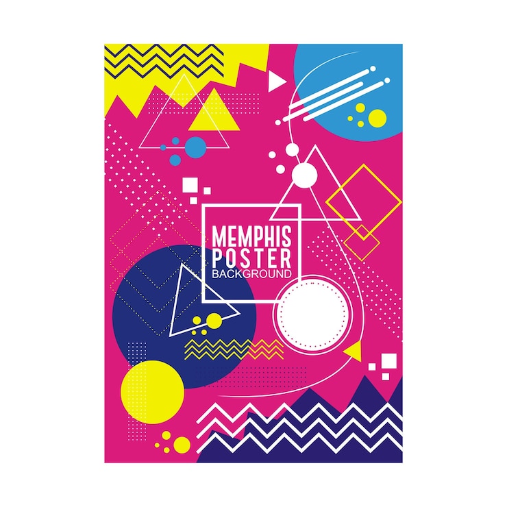
The Memphis Design Palette: Playful Geometry meets Bold Colors

Next, we land in the vibrant 1980s, home of the iconic Memphis Design Palette. This playful and daring selection of colors is a complete departure from the classic color palettes we've explored so far.
Think: Pink that pops like a neon sign, blue that echoes the Memphis Group's iconic Squiggle chair, green that stands out like a tropical rainforest, yellow that shines like the sun, and black that adds a touch of graphic punch. This palette evokes a sense of fun, rebellion, and a playful rejection of traditional design norms.
The Memphis Design Palette is ideal for projects that aim to convey a sense of boldness, energy, and individuality. It can be used for website design, fashion design, branding for playful and unexpected products, or even creating eye-catching and unconventional interior design projects.
Here are the key colors of the Memphis Design Palette:
Pink: Represents fun, playfulness, and joy.
Blue: Evokes energy, power, and confidence.
Green: Adds a touch of nature and freshness.
Yellow: Provides a sense of optimism and sunshine.
Black: Creates strong contrasts and graphic impact.
Use this palette with geometric shapes, Memphis-inspired patterns, and bold fonts to create designs that are truly unforgettable.
The Grunge Aesthetic Palette: A Touch of Edgy Nostalgia

Our final stop on this journey through time takes us to the 1990s, where the Grunge Aesthetic Palette reigns supreme. This dark and moody selection of colors embodies the era's spirit of rebellion, angst, and nonconformity.
Imagine: Black as the leather jackets worn by grunge icons, gray as the rainy skies of Seattle, brown as the worn-out jeans and flannel shirts, olive green as the mossy walls of abandoned buildings, and burgundy as the deep red wine fueling late-night discussions. This palette evokes a sense of raw emotion, rebellion, and a rejection of the polished and perfect.
The Grunge Aesthetic Palette is perfect for projects that aim to convey a sense of authenticity, independence, and individuality. It can be used for music album covers, zine design, branding for alternative brands, or even creating edgy and rebellious website designs.
Here are the key colors of the Grunge Aesthetic Palette:
Black: Represents power, mystery, and rebellion.
Gray: Evokes a sense of melancholy, introspection, and neutrality.
Brown: Adds a touch of earthiness, authenticity, and ruggedness.
Olive green: Creates a connection to nature and a sense of grunge-inspired fashion.
Burgundy: Provides a touch of sophistication and a hint of darkness.
Use this palette with distressed textures, ripped edges, and grunge-inspired typography to create designs that capture the raw and rebellious spirit of the 90s.
With these five iconic vintage color palettes at your fingertips, you can unlock a world of creative possibilities and add a timeless touch to your designs. So, explore, experiment, and let your creative spirit guide you as you embark on your own journey through the fascinating world of color and design.
Conclusion: Your Time Travel Design Adventure Awaits
The journey through time with vintage color palettes has reached its conclusion. We've explored five iconic palettes, delved into the depths of vintage color theory, and equipped you with the tools and resources to unleash your creative potential.
Now, the time has come for you to embark on your own time travel design adventure. With the knowledge and inspiration gleaned from this exploration, you can:
Reimagine your designs: Breathe new life into your projects by incorporating vintage color palettes and evoking a sense of nostalgia and history.
Connect with your audience: Tap into the emotional power of color and create designs that resonate with specific audiences through cultural associations and psychological effects.
Express your unique style: Experiment with different vintage color combinations and design elements to discover your own creative voice and develop a signature aesthetic.
Create timeless designs: By understanding the historical context and design principles behind vintage color palettes, you can create projects that are both trendy and enduring.
Remember, design is a journey of exploration and discovery. Embrace the playful spirit of experimentation, allow your creativity to flow freely, and most importantly, have fun! The world of vintage color palettes awaits, brimming with possibilities and ready to inspire your next masterpiece.
Related articles
Disclaimer:
This article is for informational purposes only. Some links may be affiliate links, meaning Advise Graphics may earn a commission at no extra cost to you. We do not guarantee results, and readers should do their own research before making any decisions.
Tags
Subscribe
Join the Advise Graphics community and get exclusive design resources, tips, and updates delivered straight to your inbox.
Copyright
© 2025 Advise Graphics. All rights reserved.
Cop© 2025 Advise Graphics. All rights reserved.


