
The Ultimate Collection of Groovy Fonts: 15+ Retro Typefaces for a Far-Out Vibe
Share
I. Introduction: Get Your Groove On!
II. What Really Makes a Font Groovy? Decoding the Retro Aesthetic
III. The Mega-Collection: 15+ Groovy Fonts to Fuel Your Creativity
IV. Where to Get Your Groove On: Creative Applications
V. When to Hit the Brakes: Avoiding Groovy Overload
VI. Pro Tips for Mastering Groovy Typography
VII. Frequently Asked Questions About Groovy Fonts
VIII. Conclusion: Keep the Good Times Rolling with Groovy Fonts
I. Introduction: Get Your Groove On!
Alright, buckle up and get ready to dig into a world of seriously far-out letterforms! There's just something undeniably cool about groovy fonts, isn't there? They're like a direct portal back to the days of peace signs, bell bottoms, and music that just grooved. As designers and creatives, we can't help but feel that magnetic pull of the 60s and 70s, and these funky typefaces are the perfect way to inject that vintage soul into our modern projects.
Now, you might have stumbled upon lists of groovy fonts before, and that's cool. But get this: we're not just scratching the surface here. Forget those fleeting glimpses – we're diving deep, headfirst, into a massive collection of over 15 of the most captivating retro typefaces you can imagine. Think swirling psychedelia, the smooth energy of the disco era, and that wonderfully hand-drawn, free-spirited vibe that defined a generation.
The beauty of these fonts? They're not just relics of the past. In today's design landscape, there's a fantastic resurgence of "newstalgia," where the best of the old school gets a fresh, modern twist. That means these groovy fonts are more relevant and exciting than ever, ready to add a unique punch to everything from branding that wants a touch of authentic cool to posters that need to scream vintage vibes.
So, what's on the menu for this deep dive? We're not just throwing a bunch of names at you. We're going to break down exactly what makes a font truly groovy, exploring the design magic behind those flowing curves and bold strokes. Then, prepare to be amazed by our extensive library, neatly organized so you can easily find the perfect retro vibe for your next masterpiece. We'll also explore a ton of creative ways you can use these fonts to make your designs truly stand out, and even when maybe, just maybe, it's best to keep the groovy vibes on the down-low.
Consider this your ultimate guide, your go-to resource for all things retro typography. So, get ready to unlock a treasure trove of far-out fonts and let's get your creativity grooving!
II. What Really Makes a Font Groovy? Decoding the Retro Aesthetic
Alright, let's really dial in on what gives a font that unmistakable groovy swagger. It's not just about looking old, you know? There's a real artistry and a whole lot of cultural history baked right into these letterforms. So, let's peel back the layers and explore the key ingredients that make a font truly, madly, deeply groovy.
First up, you've got those flowing, organic shapes. Think lava lamps, the swirling patterns in psychedelic art, and even the natural curves of flowers and vines – that's the kind of inspiration we're talking about. These aren't your rigid, straight-edged letters; they seem to move and breathe on the page. You'll often see rounded terminals, soft transitions, and a general sense of fluidity that just feels… well, groovy! Imagine the letters almost dancing together.
Then come those exaggerated curves and swirls. This is where things get really fun and expressive. These aren't just gentle bends; we're talking about dramatic loops, playful flourishes, and unexpected twists that inject a real sense of personality. It's like the font is letting loose and having a good time, mirroring the free-spirited attitude of the 60s and 70s. These curves create a feeling of dynamism and energy that's totally infectious.
And let's not forget those bold, high-contrast strokes. Many groovy fonts aren't shy – they make a statement! You'll often see thick, substantial lines paired with thinner ones, creating a visual punch that grabs your attention. This boldness reflects the revolutionary spirit of the era, the desire to stand out and be heard. It gives the fonts a real presence and impact.
But the magic doesn't stop there. A lot of groovy fonts come with playful alternates and ligatures. These are like little hidden gems within the typeface – different versions of letters or unique ways that two letters can connect. They add a layer of individuality and can make each word feel special and handcrafted. It's like the designer was having fun experimenting and giving you extra tools to play with in your own designs.
Now, let's dig a little deeper into the why behind all this visual goodness. These design elements weren't created in a vacuum. They were heavily influenced by the psychedelic art movement, with its swirling patterns, vibrant colors, and a sense of altered perception. You can see echoes of Art Nouveau's flowing lines and organic forms, but with a bolder, more expressive twist. And of course, the overall feeling of freedom and experimentation that defined the counterculture of the time is deeply embedded in these typefaces.
Think about it: these fonts evoke a sense of nostalgia for a time that, for many, represented a period of significant social and cultural change. They bring with them a feeling of warmth, optimism, and a touch of rebellion. That's the power of good typography – it can tap into our emotions and transport us to another time.
So, as you explore the massive collection we're about to unveil, keep these key characteristics in mind. Notice how different fonts emphasize different aspects of this groovy aesthetic. Some might lean heavily into those swirling psychedelic curves, while others might focus on a bold, chunky 70s vibe. Understanding these core elements will not only help you appreciate the artistry behind these fonts but also guide you in choosing the perfect one to bring that far-out feeling to your own creative projects. Get ready to see these groovy principles in action!
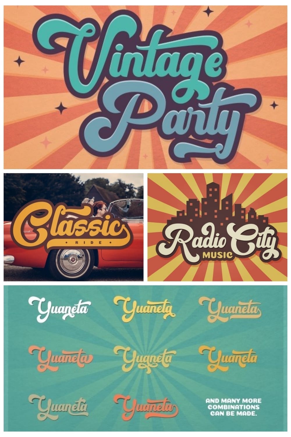
III. The Mega-Collection: 15+ Groovy Fonts to Fuel Your Creativity
Alright, enough talk about the what and the why – let's get to the good stuff! Prepare your eyeballs for a serious feast of retro goodness because we're about to dive headfirst into our Mega-Collection of 15+ Groovy Fonts. So, whether you're chasing that full-on psychedelic swirl or a more laid-back 70s cool, we've got you covered. Get ready to discover your next favorite font!

A vintage font blending groovy and psychedelic styles from the 80s. Bold, flowing, and wavy, perfect for retro, pop art, and dynamic designs.

A thick yet fluid display font with rounded, approachable letterforms. Ideal for bold headlines and branding with a sturdy, friendly vibe.
A cheerful, flowing handwritten script with a nostalgic and slightly bouncy feel. Great for retro parties, summer themes, and designs needing casual vintage charm.

A groovy handwritten font with a sweet and casual script. Featuring rounded forms and charming heart details, it's perfect for logos, branding, homeware, and any project needing a beautiful, handwritten touch of love.

Surf's up with Groovy Beach, a retro groovy font inspired by bold vintage typography. Its rounded, slightly wavy, and playful style is perfect for attractive, fun designs like book covers, posters, and merchandise with a retro beach vibe.

A versatile and playful retro display font with rounded, bubbly letterforms and a distinct outline. Perfect for greeting cards, headlines, and any project needing a sweet and cheerful retro vibe.

A funny retro display font with a playful bubble letterform. Perfect for logos, invitations, labels, and any design aiming for a cheerful, cartoonish, and retro vibe.

A retro bold script font that brings you back to the groovy vibes of the 60s and 70s. With its flowing, connected letters and available extrude effect, it's perfect for logos, invitations, and any design needing a bold, handwritten retro flair.

A bold retro script font with clean and rough versions, inspired by 70s and 80s typography. Perfect for vintage designs, logos, t-shirts, and branding needing a handwritten, groovy, and optionally textured feel.

A bold script font with a retro vintage style. Perfect for lettering and logos, with alternates and ligatures for an eye-catching design.

A cool and retro display font with stylish, distorted, and wavy letterforms, perfectly capturing the psychedelic aesthetic of the 60s and 70s. Ideal for headers, quotes, and any project needing a unique, mind-bending retro vibe.

Get funky with this gorgeous retro script inspired by 60s and 70s advertisements. With flowing, connected letters and an included extrude version, it's perfect for adding a nostalgic and energetic handwritten flair to any retro design.

A fun and groovy sans-serif display font with a bold personality and a vintage psychedelic vibe. Its rounded, approachable letterforms are perfect for creating impressive and carefree designs.

A vintage display font bringing back the groovy vibes of the 1970s disco era. Its bold, curvy, and retro-inspired letterforms create an energetic and funky nostalgic style.

A beautiful retro script font with flowing, connected letters and numerous alternates and ligatures. Perfect for posters, book covers, branding, and designs needing a warm and stylish handwritten touch.

A vintage-inspired display font with chunky, wobbly letterforms and striking curves, exuding a confident and retro 70s vibe. Perfect for eye-catching headlines, logos, and posters with a funky and slightly playful edge.

A groovy script font with an authentic retro feel, reminiscent of the 70s. Its flowing, connected letters and stylish curves bring a warm and energetic handwritten touch to any design.

A retro and groovy bold serif font with chunky, curly serifs and a playful baseline. Featuring multiple stylistic alternates, it's perfect for magazine designs, advertising, branding, and quotes with a nostalgic and soulful serif touch.
A groovy display font with bold, rounded letterforms, reminiscent of the funky vibes of the 60s and 70s. Perfect for adding a retro and energetic touch to headlines, posters, and branding.
A retro bold sans-serif font with a layered, bubbly appearance that evokes the psychedelic vibes of the 1960s. Perfect for logos, invitations, and any design aiming for a groovy, retro, and eye-catching look.
A bold and rounded retro font with thick letterforms, perfect for designs seeking a vintage and impactful style reminiscent of the 60s and 70s.
IV. Where to Get Your Groove On: Creative Applications
Alright, now that you've had a glorious peek at the sheer variety of groovy fonts out there, you might be wondering, "Where exactly can I unleash this retro magic?" Well, the possibilities are as far-out as the fonts themselves! These typefaces aren't just for dusty vintage projects; they can inject a unique personality and a touch of cool into all sorts of modern designs. Let's explore some prime real estate where groovy fonts truly shine:
Music & Entertainment: Setting the Sonic Scene
This is practically where groovy fonts were born! They're a natural fit for anything music-related that wants to tap into that nostalgic energy.
- Album Art & Covers: Whether it's a retro throwback album or a modern band channeling vintage vibes, a well-chosen groovy font can instantly set the mood and capture the essence of the music. Think bold, swirling scripts for psychedelic rock or chunky, rounded sans-serifs for a funkadelic sound.
- Concert Posters & Flyers: Announce your event with a blast from the past! Groovy fonts command attention and evoke the energy of live music from the 60s and 70s.
- Festival Branding: From the main stage banner to the vendor booths, groovy typography can create a cohesive and immersive retro festival experience.
- Music Streaming Visuals: Even in the digital realm, groovy fonts can add a unique flair to artist profiles, playlist covers, and promotional graphics.
Fashion & Apparel: Wearing the Retro Vibe
Groovy fonts can add a serious dose of cool to clothing lines and merchandise that draw inspiration from past eras.
- Vintage-Inspired Clothing Lines: Imagine a t-shirt with a bold, swirling script or a tote bag featuring a chunky, rounded sans-serif. These fonts instantly communicate a retro aesthetic.
- Streetwear Brands: Injecting a touch of vintage flair into modern streetwear can create a unique and eye-catching look. A subtle groovy detail in a logo or graphic can make all the difference.
- Merchandise Design: From mugs to stickers, groovy fonts can add a fun and nostalgic touch to various products.
Food & Beverage: Serving Up Some Retro Flavor
Believe it or not, groovy fonts can be a fantastic way to add character and a sense of handcrafted quality to food and beverage branding.
- Craft Breweries & Distilleries: A retro-inspired font can give a craft beverage a sense of history and artisanal charm. Think flowing scripts for a classic feel or bold serifs for a more rugged vintage vibe.
- Coffee Shops & Diners: Evoke a sense of nostalgia and comfort with a well-chosen groovy font on your signage, menus, and packaging.
- Organic & Natural Food Brands: A slightly whimsical or hand-drawn groovy font can communicate a sense of natural goodness and authenticity.
- Snack Packaging: Add a fun, retro twist to packaging for candies, cookies, and other treats.
Beyond the Obvious: Unexpected Groovy Applications
Don't limit yourself! Groovy fonts can add a unique touch to a variety of other projects:
- Web Design: Use them strategically for headings, logos, or accents to create a retro-inspired website without going overboard.
- Social Media Graphics: Make your posts stand out with a touch of vintage flair.
- Event Invitations: Set the tone for a retro-themed party or celebration.
- Book Covers: Add a nostalgic touch to historical fiction or books with a vintage setting.
- Art Prints & Posters: Create eye-catching designs with a retro typographic focus.
The key is to think creatively and consider the overall message and target audience. A touch of groovy can add personality and memorability to your designs in unexpected and delightful ways! Now, let's flip the script and talk about when maybe, just maybe, it's best to keep those far-out fonts in the design vault.
V. When to Hit the Brakes: Avoiding Groovy Overload
Alright, as much as we're head-over-heels for these funky fonts, it's crucial to remember that they aren't the answer to every design dilemma. Just like a perfectly seasoned dish can be ruined by too much spice, overusing or misapplying groovy fonts can lead to a design that feels dated, unprofessional, or even illegible. So, let's pump the brakes for a moment and explore some scenarios where you might want to think twice before unleashing your inner retro typographer:
Corporate Communications: Keeping it Buttoned-Up
In the realm of traditional business, where professionalism, trust, and clarity are paramount, groovy fonts often stick out like a sore thumb in a sea of sharp suits.
- Formal Business Documents: Think annual reports, legal contracts, official statements, and serious proposals. These require fonts that convey stability and authority, and the playful nature of most groovy fonts can undermine that message. Stick to clean, classic serifs or straightforward sans-serifs for these contexts.
- Internal Communications: While a touch of personality can be okay, overly stylized groovy fonts can hinder readability in important internal memos or training materials. Prioritize clarity and ease of understanding.
Technical Documentation: Clarity is King
When dealing with complex information, user manuals, scientific reports, or any content where precise understanding is critical, legibility trumps style every single time.
- Instruction Manuals: You don't want users struggling to decipher instructions because the font is too swirly or decorative. Opt for highly legible sans-serif fonts that ensure clarity and prevent misinterpretation.
- Scientific Papers & Reports: These require a sense of objectivity and precision. Groovy fonts can feel out of place and unprofessional in this context.
Medical or Legal Materials: Conveying Trust and Seriousness
Similar to corporate communications, the fields of medicine and law demand a sense of unwavering trust and professionalism. The playful or flamboyant nature of groovy fonts can detract from the gravity of the message.
- Patient Information: Clarity and ease of reading are crucial for medical instructions and information.
- Legal Documents: These require fonts that convey authority and precision. A whimsical or overly stylized font can undermine the seriousness of the content.
When Readability Takes a Hit: Style Over Substance
Some groovy fonts, while visually striking, can sacrifice legibility for the sake of their unique design. If your audience is struggling to read your message, no matter how cool the font looks, it's not doing its job.
- Small Body Text: Intricate curves and bold strokes can become a blurry mess at smaller sizes, making longer passages difficult to read.
- Low Contrast Situations: Pairing a decorative groovy font with a similarly busy background can create a visual overload and hinder readability.
Target Audience Mismatch: Knowing Your Crowd
Consider who you're trying to reach. A super psychedelic font might be perfect for a vintage music festival poster but could alienate the target audience for a financial services company.
- Conservative Industries: Fields like finance, insurance, and government often prefer a more traditional and understated visual approach.
- Elderly Audiences: Intricate or highly stylized fonts can be difficult for older individuals to read.
The Bottom Line: While we adore the personality and flair that groovy fonts can bring, it's all about context and purpose. Ask yourself: "Does this font enhance my message and connect with my audience, or does it distract and potentially hinder understanding?" Use your design judgment wisely, and remember that sometimes, a clean and classic approach is the grooviest choice of all! Now that we know when to exercise caution, let's dive into some pro tips for making the most of these fantastic fonts when you do decide to get your groove on!
VI. Pro Tips for Mastering Groovy Typography
Alright, you've got your hands on some seriously cool groovy fonts and you know when to wield their power judiciously. Now, let's talk about how to really make these retro wonders sing in your designs! Here are some pro tips to help you master the art of working with groovy typography:
Pair with Purpose: Finding Your Perfect Harmony
Groovy display fonts are often bursting with personality, which is fantastic for headlines and eye-catching elements. However, pairing them thoughtfully with cleaner, more legible typefaces for body text is crucial for maintaining overall readability and balance.
- Contrast is Key: Opt for a clean sans-serif or a classic serif font for your body text when using a highly decorative groovy font for headings. This creates a visual hierarchy and prevents the design from becoming too overwhelming. Think of it as the smooth rhythm section supporting a flamboyant lead guitarist.
- Consider the Vibe: Even your supporting font should subtly complement the overall retro feel. A slightly rounded sans-serif might pair well with a softer groovy script, while a more geometric sans-serif could work with a bolder, chunkier retro display font.
- Limit the Font Family: Generally, stick to a maximum of two different font families in your design. Overcrowding with too many styles can create a cluttered and amateurish look.
Mind Your Spacing: Give Those Curves Some Room to Breathe
The organic shapes and exaggerated curves of many groovy fonts often require extra attention to kerning (the space between individual letters) and leading (the space between lines of text).
- Kerning Adjustments: Pay close attention to how the unique shapes of groovy letters interact. You might need to manually adjust the spacing between certain letter pairs to ensure a balanced and visually pleasing rhythm. What looks good by default might need a little tweaking.
- Generous Leading: Give your lines of text ample vertical space. This is especially important with bolder or more decorative groovy fonts, as it prevents the lines from feeling cramped and improves readability. Let those groovy shapes have room to breathe!
Consider Scale: Let Those Details Shine
Groovy fonts often have intricate details and unique characteristics that truly come to life at larger sizes.
- Headlines and Titles: These fonts are perfect for making a statement in headlines, titles, and logos where their personality can really shine.
- Avoid Tiny Text: Using highly decorative groovy fonts for small blocks of text can make them illegible. Save the intricate stuff for larger applications.
Color Thoughtfully: Setting the Right Mood
While the 60s and 70s were known for their bold and vibrant color palettes, modern applications might call for a more nuanced approach when pairing colors with groovy fonts.
- Embrace Retro Palettes: Consider using color combinations that were popular during the era that inspires your font (e.g., avocado green and mustard yellow, burnt orange and cream, psychedelic purples and blues).
- Contrast for Legibility: Ensure sufficient contrast between your text color and background color to maintain readability.
- Modern Subtlety: Don't feel limited to loud colors. A groovy font can look equally striking in a more subdued or monochromatic palette, allowing its unique shapes to take center stage.
Backgrounds and Imagery: Creating Visual Harmony
The visual elements you pair with your groovy fonts can significantly impact the overall retro feel and effectiveness of your design.
- Vintage Textures and Patterns: Consider using subtle textures like paper grain or halftone patterns, or geometric patterns reminiscent of the era.
- Retro Photography and Illustration: Pairing your groovy typography with imagery from the 60s or 70s can create a strong visual connection.
- Clean and Minimal Backgrounds: Sometimes, letting the groovy font be the star against a clean, uncluttered background can be the most impactful approach.
By keeping these tips in mind, you can harness the full power of groovy fonts and create designs that are not only visually striking but also effective and engaging. Now, let's tackle some of those burning questions you might have about working with these far-out typefaces!
VII. Frequently Asked Questions About Groovy Fonts
Alright, let's dive into some of those frequently asked questions that often pop up when designers start exploring the wonderful world of groovy fonts. You're not alone in wondering about these things, so let's get some clarity!
What exactly makes a font look "60s"?
Ah, the million-dollar question! The "60s look" in typography is often a fantastic cocktail of several key ingredients:
- Flowing Organic Shapes with a Twist: Think rounded forms, almost like bubble letters but with a more sophisticated, often psychedelic edge. There's a sense of movement and fluidity, often inspired by the art nouveau revival that was happening during that time, but with a bolder, more expressive flair.
- Bold Strokes and Rounded Terminals: Many 60s fonts feature thick, substantial letterforms with soft, rounded ends, giving them a friendly yet impactful presence.
- Psychedelic-Inspired Curves: You'll often see unexpected bends, loops, and flourishes that evoke the swirling patterns and altered perspectives of psychedelic art.
- A Touch of Flower Power: Some fonts incorporate softer, more decorative elements that hint at the peace and love movement.
It's this combination of organic movement, bold forms, and a hint of playful psychedelia that often screams "Sixties!"
Are groovy fonts still relevant in today's design landscape?
Absolutely! While they definitely have strong ties to a specific era, groovy fonts have found a vibrant new life in modern design. This is largely thanks to the "newstalgia" trend, where designers are cleverly blending retro elements with contemporary aesthetics. Groovy fonts can add:
- Unique Personality: In a sea of often similar-looking modern fonts, a touch of groovy can help your brand or project stand out.
- Emotional Connection: They evoke feelings of nostalgia, warmth, and a sense of fun that can resonate with audiences.
- Visual Interest: Their distinctive shapes and curves can add a dynamic and engaging element to your designs.
The key is to use them thoughtfully and strategically, often paired with cleaner elements to create a balanced and contemporary feel.
Can I actually use groovy fonts for professional projects?
Yes, you certainly can, but with a healthy dose of consideration for the context and your brand identity! While a full-blown psychedelic font might not be right for a corporate law firm, there are many ways to incorporate groovy fonts professionally:
- Brands with a Retro Vibe: If your brand aims for a vintage, handcrafted, or artistic feel, a well-chosen groovy font can be perfect for your logo and branding materials.
- Creative Industries: Designers, musicians, artists, and other creative professionals can often embrace groovy fonts to showcase their unique style.
- Marketing and Promotion: For specific campaigns or events that tap into a retro theme, groovy fonts can be highly effective in capturing attention.
The trick is to choose a font that aligns with your brand's personality and the message you want to convey. Sometimes, a subtle nod to the groovy era with a slightly rounded sans-serif or a clean script with a retro feel can be just as effective as a full-on psychedelic explosion.
Where can I find high-quality groovy fonts?
There are tons of fantastic resources out there! You can find both free and paid options on:
- Dedicated Font Foundries: Websites of independent type designers and foundries often have unique and high-quality groovy fonts.
- Creative Marketplaces: Platforms like Creative Fabrica, Envato Market, and MyFonts offer a vast selection of fonts from various designers.
- Subscription Services: Services like Adobe Fonts and others provide access to extensive font libraries for a monthly fee.
- Free Font Websites: Be cautious with free font sites and always double-check the licensing terms, especially if you plan to use the font for commercial projects. Reputable free font sources include Google Fonts (though genuinely "groovy" options might be more limited) and carefully curated lists on design blogs.
What are some tips for choosing the right groovy font for my project?
- Consider the Era: Do you want a 60s psychedelic feel, a 70s disco vibe, or something more broadly retro?
- Think About Legibility: Will your audience be able to easily read the font, especially at smaller sizes?
- Match the Mood: Does the font's personality align with the overall tone and message of your project?
- Check the Character Set: Does the font include all the characters, symbols, and language support you need?
- Test it Out: Always try out the font in your design software before committing to it. See how it looks with your colors, imagery, and layout.
By considering these questions, you'll be well on your way to selecting the perfect groovy font to add that far-out flair to your creative endeavors! Now, let's wrap things up and keep those groovy vibes alive!
VIII. Conclusion: Keep the Good Times Rolling with Groovy Fonts
Alright, design adventurers, we've journeyed through the vibrant world of groovy fonts, explored their psychedelic souls, and learned how to wield their retro power wisely. We've seen where they shine, when to tread lightly, and picked up some pro tips for making them truly sing in our designs.
The bottom line? Groovy fonts are more than just a nostalgic throwback; they're a testament to a truly creative and transformative period in design history. When used thoughtfully and with purpose, they can inject a unique personality, a sense of warmth, and a touch of undeniable cool into any project.
Whether you're crafting eye-catching designs for a music festival that wants to channel those vintage vibes, branding a handcrafted product with a touch of authentic soul, or simply looking to add a sprinkle of fun and nostalgia to your next creative endeavor, these far-out fonts offer a universe of possibilities for expressive typography.
Just remember to always consider your audience, the context of your project, and the overall message you want to convey. Balance that retro flair with readability and a touch of modern sensibility, and you'll be grooving in no time!
Now, we'd love to hear from you! What's your favorite groovy font from our mega-collection (or any other that gets your retro heart racing)? Drop a comment below and let us know how you're using these fantastic typefaces in your designs! Let's keep the conversation flowing and share the groovy love!
Tags
Follow Us
Popular Posts


Ads


